
Is this read for you? TL;DR of these 2K words:
If you want stakeholders to act, you need opportunities, not fragmented insights
Synthesising insights into opportunities is similar to solving a mystery jigsaw puzzle:
1) you need all puzzle pieces (UX, quant, qual) to complete the picture.
2) if synthesis feels like a mess, you’re doing it right.
3) you can’t control what’s in the picture. Your job is completing the picture.Framework first, some real life examples after
Opportunities are the bread and butter of Product Discovery. It’s where all the hard research work you’ve done so far finally comes together.
How do you go from insights to an opportunity though?
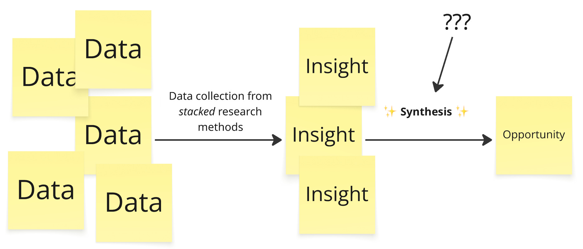
Individual insights are fragments of a bigger picture: the opportunity. To reveal that picture, you need to go through the process of combining, puzzling and making sense of it all: the synthesis.
Why is it so important to get this right?
Stakeholders simply don’t act on (or care about) just insights alone.
The value of all that data you collected and all those insights you drew is locked up until they lead to (better) decision making, for which you need opportunities.
Synthesising insights into opportunities is like solving a mystery jigsaw puzzle
Image source: boardwalkpuzzles.com
Do you know mystery jigsaw puzzles? It’s a regular jigsaw puzzle but with a different or even no picture on the box. You have all the pieces, but you have no idea what picture is shown until they’re all nicely fitted together.
I found that synthesising insights into opportunities works similarly. The puzzle pieces being the insights, the complete picture that is revealed once they’re all fitted the opportunity.
This is how they’re similar:
1. You need all the pieces to complete the puzzle
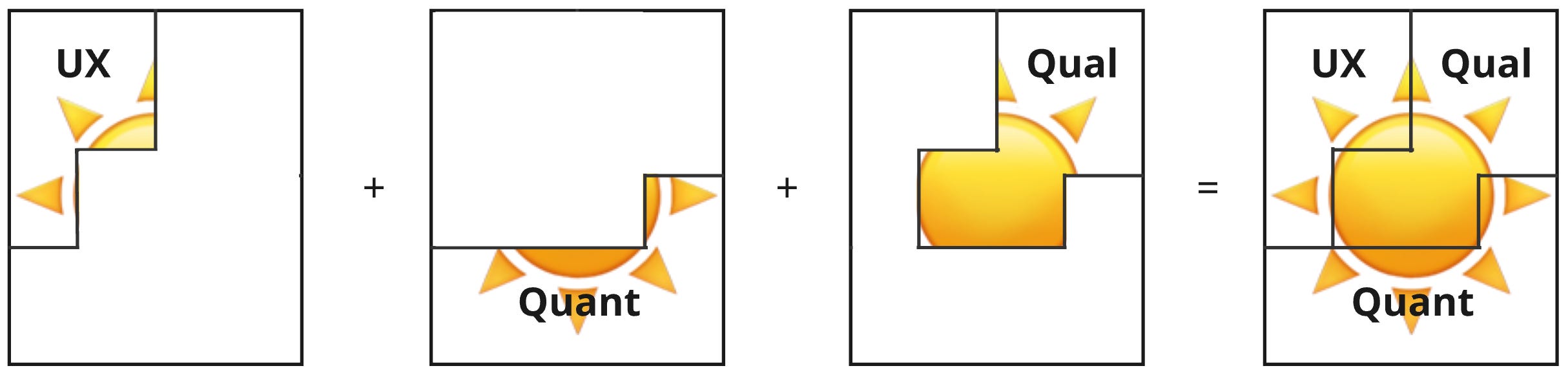
There are 3 types of puzzle pieces, and we need all of them to complete a puzzle and reveal the opportunity:
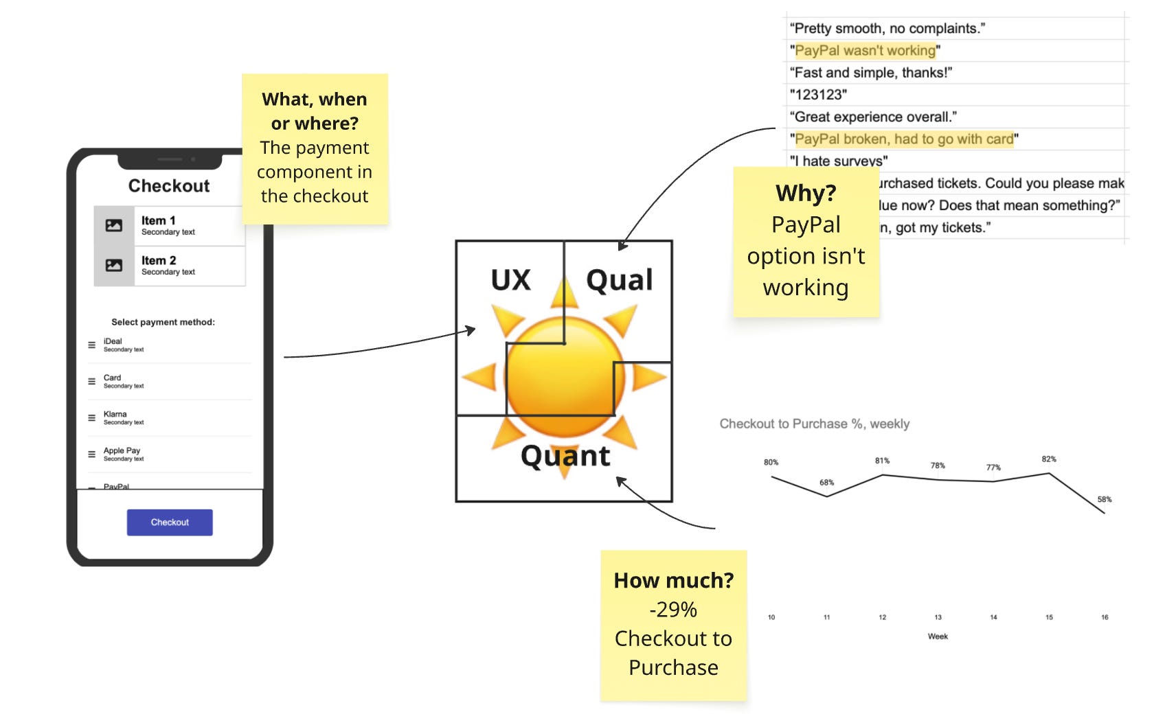
The UX puzzle pieces answer the what, when and where. Without these, you have no tangible sense of the opportunity in the user’s situation
The quantitative data puzzle pieces answer the how often or how much. Without these, you have no idea about the scale or magnitude of the opportunity
The qualitative data puzzle pieces answer the why.Without these, you have no idea of the underlying cause
Check out the previous post if you want to know more about these data types.
Omit any of them and you’ll have:
an incomplete picture and understanding, which means
..unanswered questions and uncertainty, which means
..surprises later down the line (“oh, this feature actually only affects 1% of users?”) worst case, or a total lack of action from stakeholders best case
2. It’s a mess and that’s a good thing
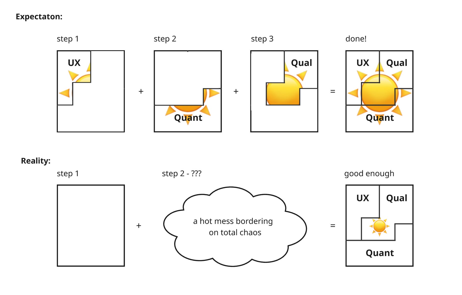
Synthesising insights into opportunities is nothing like a 3-step linear process. Don’t think linear LEGO instructions, think chaotic jigsaw puzzles.
Pieces are scattered everywhere. They’re picked up, fitted, removed, rotated, picked up again and thrown back to the pile.
Entire sections are moved around based on how other sections are turning out and sometimes you just need to step away and return with fresh eyes before a piece clicks.
Synthesis is similar. One insight can affect how you interpret the other, sometimes you need to complete the qual study before you can do the quant study, and sometimes the opportunity only makes sense once you’ve fitted the final piece of a completely different puzzle.
Insights unlock each other. If it feels chaotic, you’re doing it right.
3. You can’t control what is in the picture, only that it’s complete
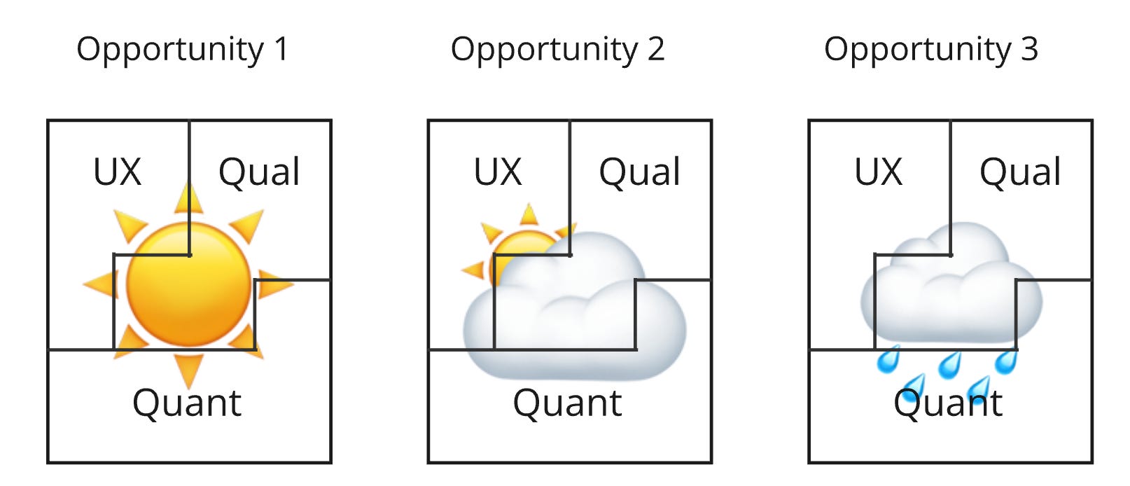
The whole point of a mystery puzzle is that you don’t know what’s in the picture.
Similarly, we don’t know upfront whether the insights are going to reveal a high-value shiny opportunity or a disappointing rainy-day one. That’s not our worry during the synthesis.
Our worry is completing the puzzles so we’re in a position where we can properly assess that.
The goal is better decision making, even if that means deciding not to proceed with an opportunity because it’s not as nice as you hoped. That’s ok and arguably the whole point.
Up next are 3 real life examples. One for each of the talking points we just went over:
Example 1 is very simple and shows you need all 3 pieces to complete the puzzle
Example 2 shows the hot mess
Example 3 shows a complete picture that’s not so sunny, but still valuable
Example 1: Users can’t pay for their concert tickets
You’re the PM of a concert venue that sells tickets through their website.
Let’s say you’re checking your weekly analytics reports and see a drop of -29% in the Checkout to Purchase rate.
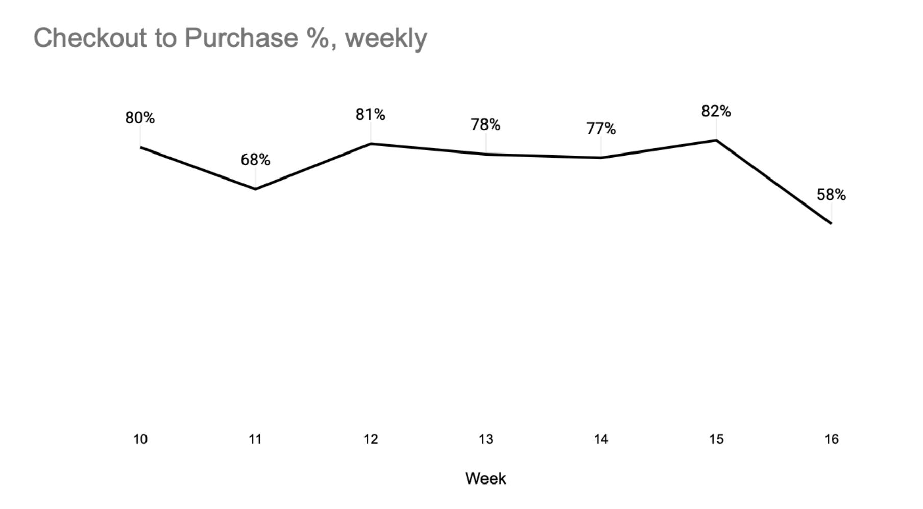
Thats your first quantitative puzzle piece. You know how much something is hurting Checkout to Purchase, but no further specifics.
You filter your survey feedback to that week and see something like this:
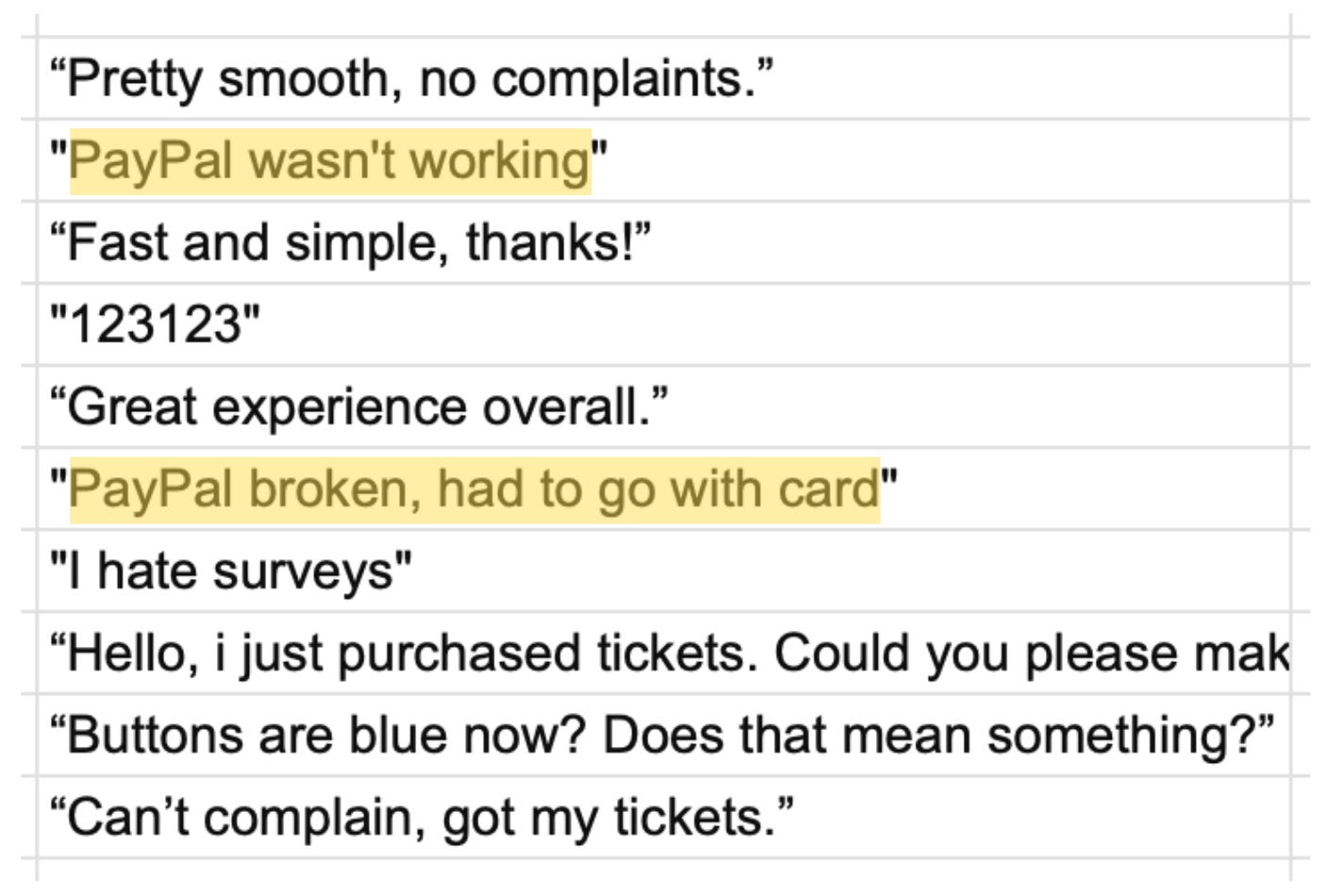
You now have two pieces: you know checkout conversion is dropping by -29% (how much), likely because “PayPal wasn’t working” (why).
Yet we don’t really know what “wasn’t working” means. We’re missing the what, when or where of the UX piece.
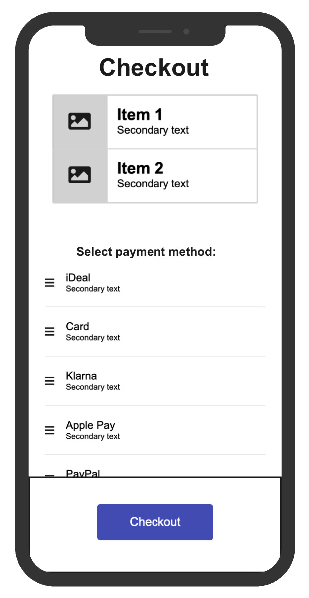
Thats the final piece of the jigsaw puzzle. We can now see what is in the picture. The latest release which made the checkout CTA sticky blocked the PayPal payment option, causing a -29% drop in Checkout to Purchase.
This is obviously a simplified example which shouldn’t happen in more mature teams (though you might be surprised how often simple things can still break). The point is that we only understood what was really happening after we nicely fit all the pieces together.
Example 2: Users can’t find anything that they like
You’re the PM of a marketplace for secondhand design stuff.
Let’s say you did a usability test focused on the cart. Funny enough, what really stood out was users trying to find a product that they like before they even got to the cart.
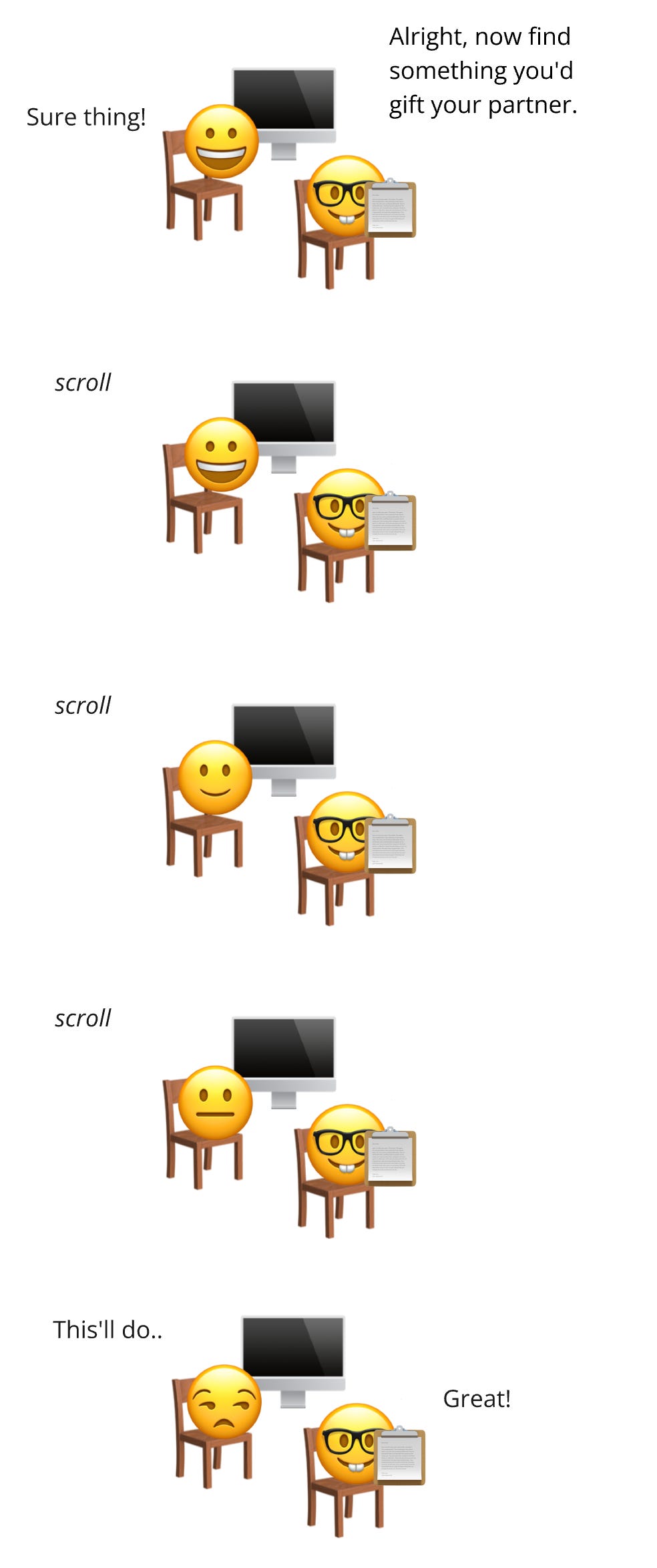
They just scrolled aimlessly and end up selecting a random product for the sake of completing the usability test. You’re confident that your catalogue has something that they like; so what’s the problem?
We could try fitting the quant puzzle piece and verify what we observed using analytics, but what would we be looking for? Conversion rate? Add to cart rate? Product category views?
“Users aimlessly scrolling” is a too vague to quantify for now. We need more specific questions first.
We can’t make the quant puzzle piece fit, yet.
Later that week you ask a friend to pull out their phone to try and find something that they like. You focus specifically on the UX, and how they engage with the pages and features. You observe similar aimless scrolling as in the user test, but you also notice:
They get stuck in the top most-generic level of categories: All Products, New in, Sale. They didn’t use any of your quick links to get to deeper, more specific categories.
They don’t care about your Style pages which could help them identify what they like and find more specific and niche products.
They miss the filters for price, to nudge them into filtering down to a list of products specific for their budget
You have all these nice features to help users find what they like, but nobody sees or engages with them.
These UX observations give us the specific questions we missed before when trying to fit the quant puzzle piece.
Are feature engagement rates low across all users?
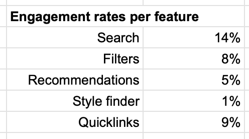
Yes, absolutely.
How many products do people typically view?
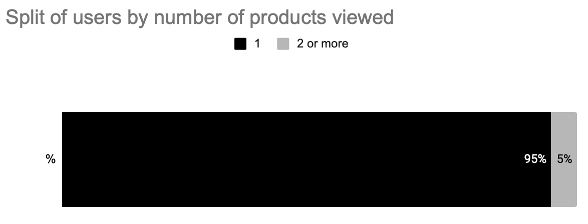
Only 5% of users view more than 1 product.
Do users return, or give up permanently?
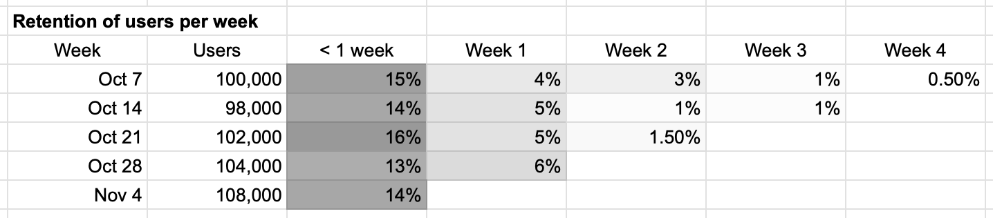
Only 15% of users return within a week.
Turns out, the opportunity revealed now that all pieces are fitted is not that users don’t like what we have on offer. We do have products that they like; we just fail to surface and show it to them (fast enough).
Seeing these numbers and the UX in practice now totally explain the aimless and disinterested scrolling from the participant in the user test; we just had to cycle through the pieces:
Qual: initial observation about aimless scrolling
Quant: tried to fit this piece, but we missed specific questions
UX: observed our friend not seeing / engaging with our discoverability features
Back to Quant: confirmed this in the data thanks to the more specific questions
Back to Qual: now the aimless scrolling makes total sense
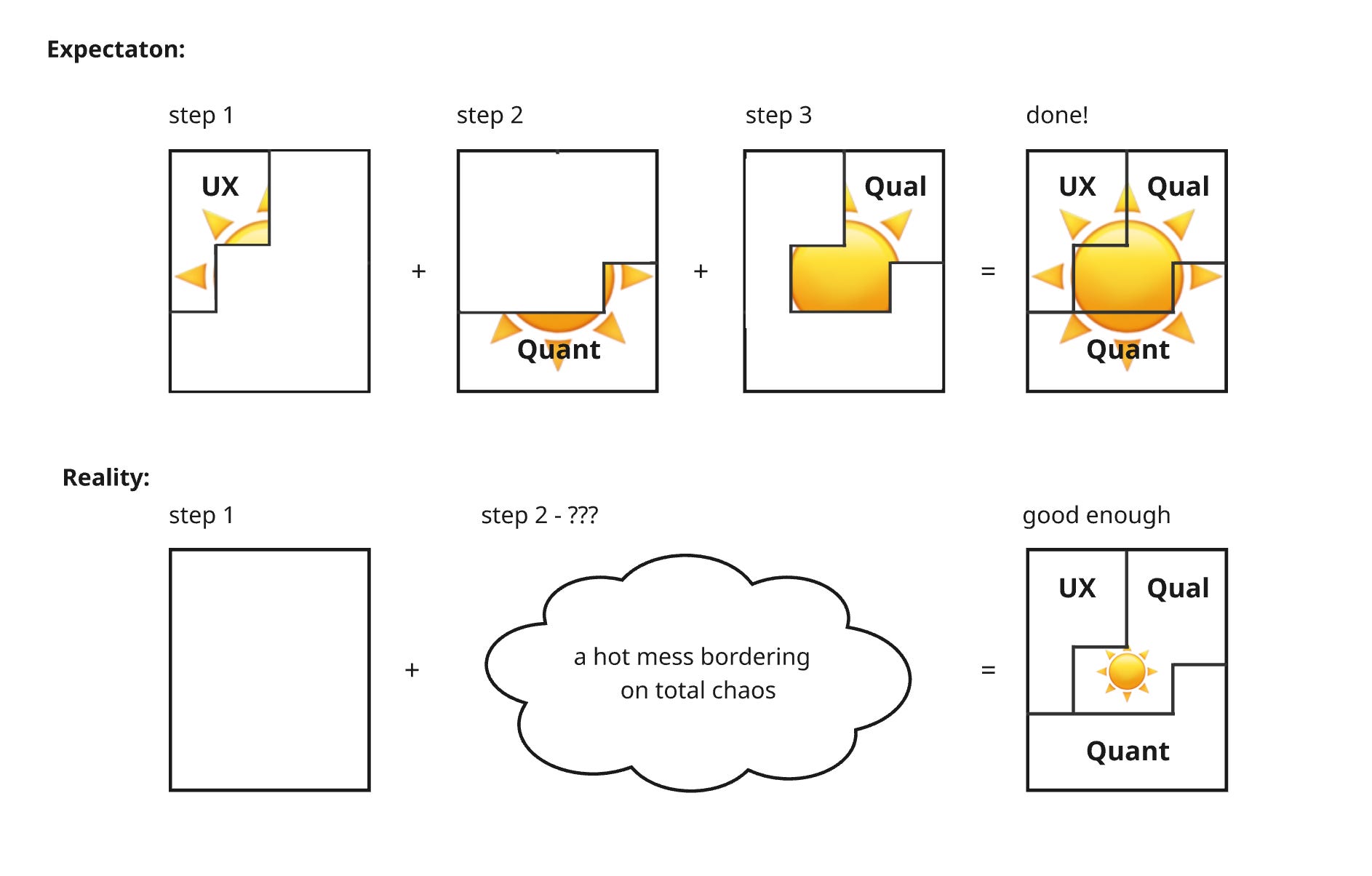
Fitting a piece can sometimes help you fit others better, just like how fitting the outside pieces of a jigsaw first help make sense of the inward pieces.
Example 3: Users don’t care about the chatbot
You’re the PM of bookkeeping software for freelancers.
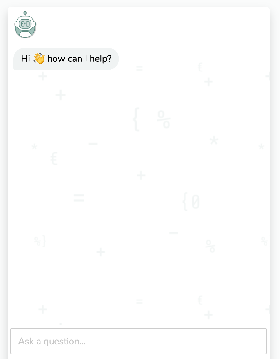
Lets say your app has a simple chatbot to answer common bookkeeping questions that has been live for a couple of months:
The founder is aboard the hype train and now wants to expand the bot with more extensive AI features. They want the bot to be able to answer more complex tax questions and enable it to give projections by integrating it with users’ invoice data.
You’re excited to give this a go. You don’t directly commit 3 sprints to building though; you do the synthesis first.
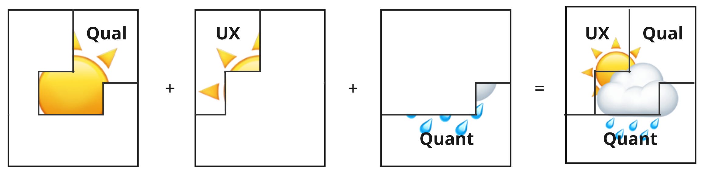
The survey results are promising: 64% of users say they want better help with bookkeeping questions. A strong initial qualitative piece.
The UX piece also fits nicely. A prototype you built was well received by users. They understood how to ask questions and considered the responses accurate.
Th quant piece delivers a reality check though. You see what’s really in the picture:
The current chatbot works well when used (80% resolution rate), but only 2% of users have ever used it.
Internal help pages that also answer complex tax questions hardly get any traffic: 100 views in the last 6 months
The community forum only had 2 posts in the last 6 months about tax questions
Users need better help with bookkeeping questions, but there is no evidence they want it inside your app. They don’t care about the chatbot. They’ve already solved this problem elsewhere: google, the official site of the government and, of course ChatGPT.
Expanding and improving this feature (with AI) doesn’t magically create the demand for it. No matter how cool this feature would’ve been, it likely would’ve gone unused. It’s not worth trying to compete with ChatGPT.
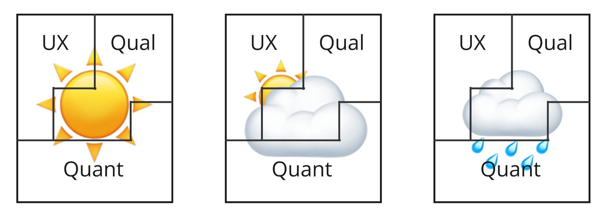
Disappointing sure, but like a mystery jigsaw puzzle: we can’t control what’s in the picture.
We can only control that the picture is as complete as possible so we can properly assess whether the opportunity shown is worth chasing. Sunny, cloudy or rainy: they’re all valuable when it comes to decision making.
In this case, that means not committing to building the AI bot. A decision that saved us 3 sprints worth of work that can now be allocated to a different (more shiny) opportunity.
Recap
Individual insights are just fragments of a bigger picture: the opportunity To reveal the full picture, you need to go through the synthesis.
Synthesis is like solving a mystery jigsaw puzzle. The insights are the puzzle pieces, the complete picture that is revealed once all pieces are in place is the opportunity.
Next time you’re solving a puzzle / synthesising insights, remember this:
You need all the pieces to complete the puzzle
You need the UX pieces; without them, you miss the what, when and where
You need the quant pieces; without them, you miss the how often or how much
You need the qual pieces; without them, you miss the why
Omit any of them and your picture is incomplete.
It’s a mess and that’s a good thing
Insights unlock each other. If it feels chaotic, you’re doing it right. Embrace it.
You can’t control what is in the picture, only that it’s complete
The whole point of a mystery puzzle is that you don’t know what’s in the picture.
Your job isn’t to improve what’s in the picture; you can’t. Your job is to complete it. Once complete, you can properly assess the value and make informed decisions, even if that means trashing the entire thing.